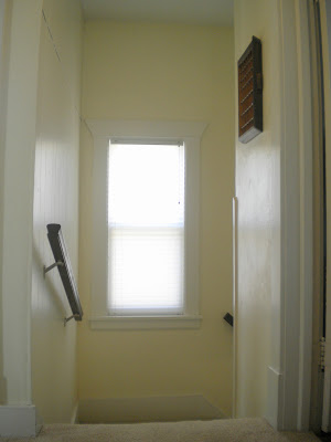
Remember back here when I told you I had plans for the other side of my boring stairwell?? Well, I am back, with photos, for the big reveal. In case you forgot, this is what we have been looking at for the last fifteen months since we moved in.
One more before photo from the hallway upstairs. So boring!
It wasn't much to look at. But now!! Well, I think it's a bit better, don't you? (Unfortunately these after photos aren't totally spectacular, but you get the idea.)
This is how it went. I saw this picture on Design Sponge:
I love the way the curtain swoops off the to the side, it's soft yet pops and it allows a ton of light to come in which is a must. Doesn't it add so much to the window? Along with that image is a really great tutorial on sewing a curtain of this style, make sure to check it out!
I found my fabric at Hancock on sale for $5 a yard! I bought two yards so all it cost me was $10 and a few hours of time. Luna made sure to get in on the action, per usual.
Once that drama was over. I painted. I immediately loved the blue gray wall with the dark stain I put on the handrails.
We actually had this paint in our basement already. It was left over from the previous owner, and it is the color of our bedroom. Which ties to to the spaces together quite nicely. See?
With the curtains made and the wall painted, all that was left to be done was to hang my location love posters that I got from Ork Posters.
Here is a nice action shot of the man of the house!
Before:
After:
Before:
After:
There is still some tweaking to be done here. I plan to paint the frame for the Chicago Poster white to match the St. Paul Poster frame. And I'm not sure if the shelf will stay or get replaced with something else, or maybe I will cover it with something, as I am not digging all the different woods going on. But for now, I am very happy with the overall improvement.
Oh and my favorite little bit. This red button I used for the sash. It's a subtle but awesome little pop.
In other news, I am working on a house tour for those of you who are not acquainted with the layout of our place. It may be a while, but it will eventually show up! Thanks for stopping by!


nice! i love the transformation.
ReplyDeletethanks, dear.
Delete